Is Your Law Website Designed for Today's Micro-Moments?
How Stolen Moments Shape a Client's Journey
Micro-moments occur when people reflexively turn to a device — increasingly a smartphone — to act ... They are intent-rich moments when decisions are made and preferences shaped. — How Micro-Moments Are Changing the Rules
A modern-day adage says that 80% of success is just showing up. Except, in today's ever-expanding universe of websites, just showing up is no longer enough. You also have to perform.
Today, websites must both inspire and inform, all in the micro-moment when preferences are shaped. Then, they need to continue to deliver throughout the longer, fragmented journey consumers now take as they hopscotch across multiple devices — smartphone, tablet, and desktop.
And to keep up, your website needs to shapeshift like a virtual Houdini all along this path: Offering a really big show for widescreen laptops, but just a petite teacup performance on mobile screens. All while keeping your message center stage.
The importance of making a big impression on the small screen escalated in 2015 when Google announced that more searches were performed on mobile devices than desktops.
The availability of information on multiple devices — at home or on the go — has fragmented the consumer journey into a hundred micro-moments.
And it is these stolen minutes that have the power to shape your prospective client’s journey.
First-round research on an attorney can take place in stolen moments at work or at play on whatever device is handy. It’s during these micro-moments that people whittle down their lists to a select few names, which they email to themselves for a deeper dive later.
Savvy attorneys understand that showing up at multiple points along the decision path gives them the opportunity to nudge a prospective client down a new path or reinforce the path they are on.
"Search" Leads to "Research"
Search is the invaluable first step on a client’s longer journey of research. And these days mobile dominates search.
Over the course of more than 21 years managing websites, Einstein Law has tracked the shift to mobile by analyzing millions of interactions on our clients' websites. Our data drives home the point that lawyers must adapt to a mobile world: 54% of people access our clients' sites from mobile phones (46%) or tablets (8%), based on data pulled in May 2016.

The chart below shows the shift. Desktop and mobile traffic to client websites was neck and neck, but then during the fall of 2015, mobile devices surged ahead.
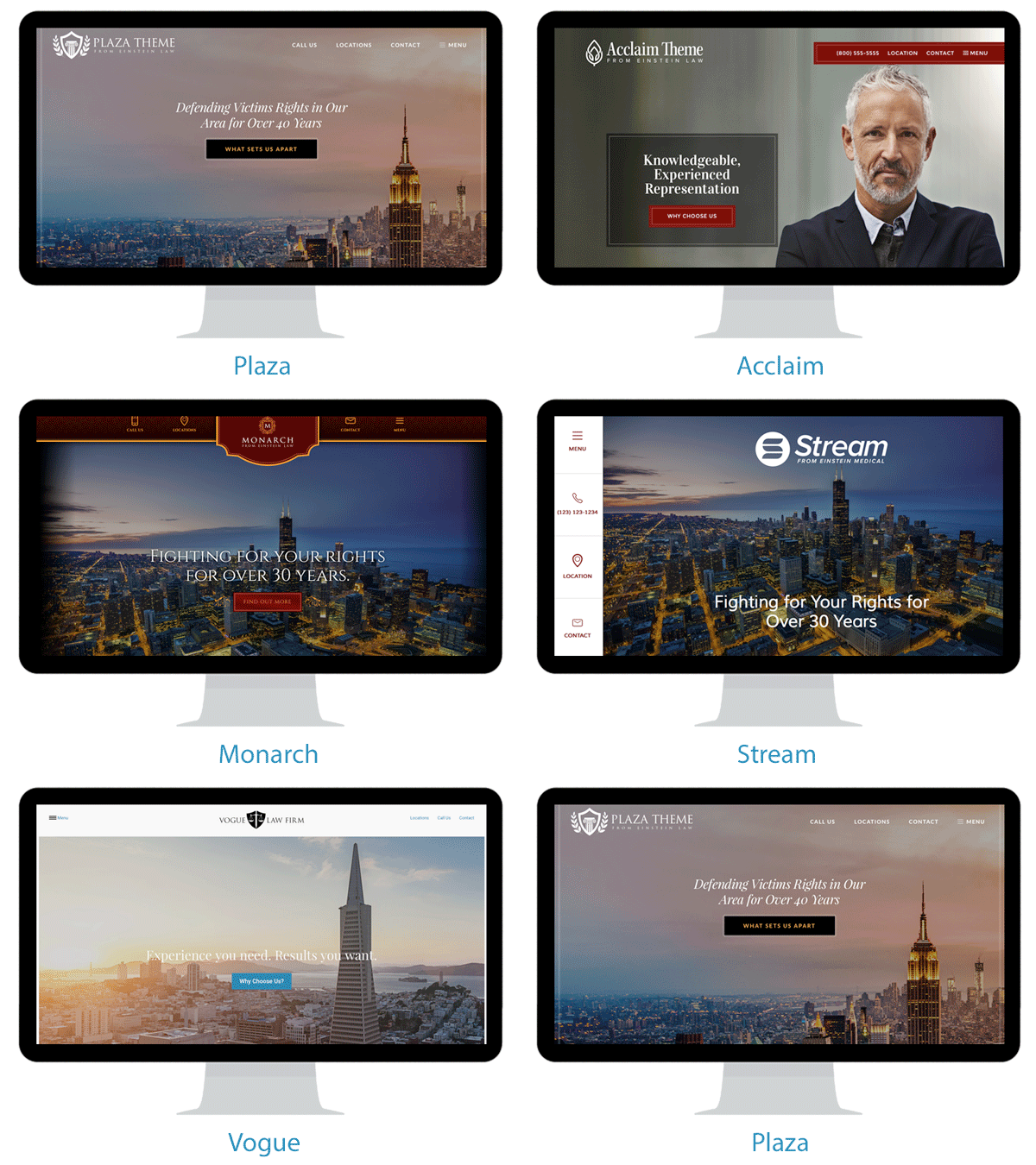
Einstein Law has created hundreds of websites for lawyers, giving us the data essential for tracking the digital body language of millions of potential clients on legal websites.
These digital touchpoints leave a trail of virtual breadcrumbs that reveal what works and what doesn't in converting visitors into clients.
Frankly, it’s a treasure trove of data-driven insight few companies in this specialized market have.
Many web design companies simply lack niche-specific data essential for enlightened design decisions. Instead, they are forced to rely on anecdotal data or wide-ranging Internet trends. They then cross their fingers and hope that these generic trends carry over to legal websites.
At Einstein Law, we rely on data, not hunches.
The New Normal: Multi-Device
Our data also shows that mobile is only part of the story.
Consumers today shift among multiple devices throughout their journey of discovery, research, and purchase. It's not just mobile first. It's multi-session on a dizzying variety of screen sizes and devices.
Grab your phone or tablet and see for yourself how gracefully this website performs on different devices.
Einstein Law research shows that potential clients who are likely to convert interact with our clients' sites multiple times on multiple devices before they contact the practice.
Key to this traffic pattern are websites designed to ensure clients have a memorable experience on every device. Good user experience is the secret sauce that encourages repeat visits, boosting the likelihood that online visits will evolve into an in-office consultation.
Our statistics from spring 2016 show there is a 49% chance that a client who fills out a contact form has been to your site at least one other time before they decide to reach out.
Naturally, if it takes multiple website visits before people feel comfortable contacting your practice, it's essential that their first impression doesn't drive them away. Because, once gone, they may never return:
-
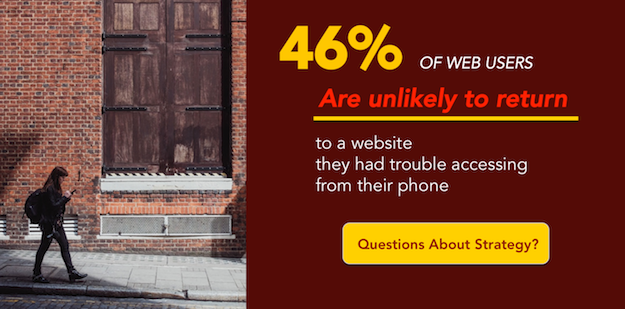
46% of mobile web users are unlikely to return to a website they had trouble accessing from their phone and 57% are unlikely to recommend the site.
-
35% of tablet users visiting a website with a poor performance are less likely to return to the site, even using another device.
Each design faux pas introduces an opportunity to lose a prospective client. Not only does your website need to be visually attractive and informative, but in this mobile world, it must also be easy to use on every device.
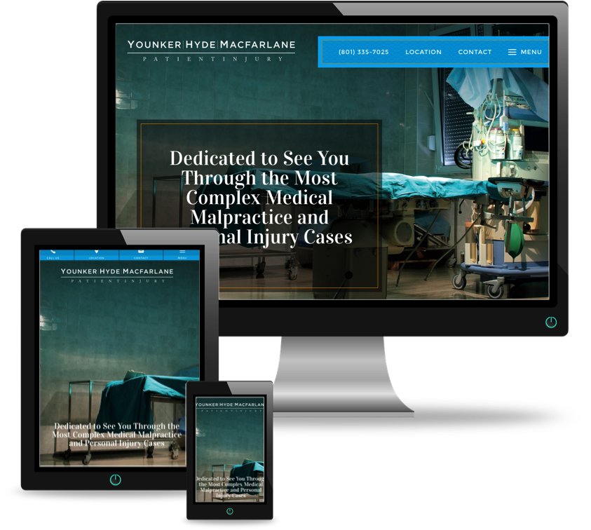
Einstein Law's responsive websites address your visitor’s needs by gracefully resizing to accommodate the dimensions of whichever device a potential client reaches for: from widescreen expanses on desktops to the smaller, vertical format of a smartphone.
See for yourself:

In today's multi-device world, design has more hurdles than ever to overcome. As consumers jump from mobile to laptop, design has to keep pace.
Don't be lulled into complacency by assuming the journey for important decisions like legal advice happens only on desktops.
Be ready for the micro-moment.
Responsive Websites for Attorneys
More - Form & Function in Website Design: The Art of Persuasion


